25 September, 2008

~~ Annie Selke

I was visiting the Vanguard furniture website which is where I came across Annie Selke. She will be or is in the process of designing a furniture line for them.


21 September, 2008

16 September, 2008

~~ Something Old...

should be in a room. Look at the two photos below. The first shows quite a contemporary dining room. Table and chairs and lamp are modern. Chandelier is filled with curlicues and lots of lamp shades making it the busiest element in the room. However, it's the mirror I adore. With its silver worn away it has a ghostly romantic quality.


This room completely different in style, much more country and relaxed has a great cupboard. Rustic and not afraid to show it's age. There looks to be an Adirondack chair in the foreground which also appears rustic.

15 September, 2008

~~ Iceland

Not real sure what inspired me to look for images of Iceland except a desire to visit this very overlooked place. While my other/better half is wanting to visit the Carribean and sandy warm beaches I'm not in the mood. I'd rather visit Prague, Vancouver or Iceland! All images are from TrekEarth.

I can't help but love these images and the unusually beautiful landscape.


10 September, 2008

~~ Sideboards, Dressers, Credenzas - Oh My!


Pottery Barn - Love the gray look and simple lines.


Williams-Sonoma - love the dark wood and simple almost Danish look however the legs kinda bother me.... anyone else?


Williams - Sonoma - Pretty and classic dresser. Very elegant and feminine.


Pottery Barn - Adore this!!! Which translates to I WANT THIS!


Pottery Barn - AND THIS! :)

05 September, 2008

~~ Kraftmaid Kitchens


Browsing the Kraftmaid website (I recently received the new Metropolitian Home magazine and saw a really nice ad but alas the kitchen pictured isn't on their website) I found these and thought they were very nice.

This kitchen seems so light and airy almost cottage like. I love the hutch!


I love the glass front floor to ceiling storage cabinets for pretty things.


Quite traditional but they mixed different colors in the cabinets and I really like the angled bar.


I like the brick on the wall and backsplash and the red walls with the pretty but not overly done stenciling. I also like the mix of blond wood with the blue-gray painted wood cabinets. It's not boring nor predictible.

02 September, 2008

~~ Traditional Home


This is a relatively small kitchen featured in Traditional Home magazine. What I like is the symmetry (and I usually don't care for that but...). I like the mix of materials. Love what looks like frosted glass top cabinets in the middle and the dark and light woods of the remaining cabinets. I also applaude that they did not attempt to match the floor.


I complained about boring beige in my last post and yes this is bordering on boring but!!! The fabric for the drapes and roman shades is wonderful! I also like the balance of the very large pattern in the fabric with the framed artword over the bed. Tiny images encased in generous matting and frames.


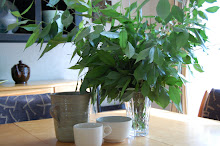
Gorgeous! Just gorgeous! When can I move in?


Kitchen from the above home. Relaxed with a lot of very traditional touches. Marble, painted cabinets many with glass fronts. Gray subway tile that sooths the stainless fridge. Very very nice.